
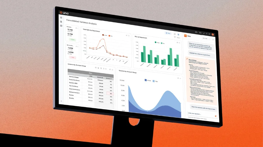
Most finance teams treat AI as a point solution to improve a dashboard, but the teams pulling away from the pack treat AI as permanent infrastructure. Building AI into your reporting stack handles data validation, anomaly detection, and automated commentary without human intervention, transforming how reporting works.
Why Using AI for Dashboards Is the Wrong Frame
When most finance teams adopt AI for dashboarding, they adopt it as a point solution: use it to generate a summary here, format a chart there, clean up commentary before it goes to the board. This is valuable. It is also fundamentally limited.
Point-solution AI adoption creates two problems.
First, it is entirely dependent on someone remembering to use it. The moment a deadline is tight or a team member is out, the AI step gets skipped and the old manual process takes over. There is no compounding value — every month starts from zero.
Second, it leaves the most important AI capabilities completely untouched. Anomaly detection. Real-time variance alerting. Cross-functional data reconciliation. Automated narrative generation calibrated to your house style. None of these happen when AI is a tool someone occasionally picks up. They only happen when AI is wired into the workflow permanently.
The Four-Layer AI-Native Reporting Architecture
A fully AI-integrated reporting stack has four distinct layers, each handling a different phase of the data-to-decision pipeline.
Layer 1: Data Intake and Validation
This is where most finance teams hemorrhage time without realizing it. Raw data from ERP systems, CRMs, HRIS platforms, and operational tools arrives inconsistently — different timestamp formats, duplicate entries, misaligned cost center codes, revenue recognized in the wrong period. Analysts spend hours reconciling these discrepancies before the data is even ready to analyze.
AI at this layer performs three functions automatically. It identifies structural anomalies in incoming data before they propagate downstream. It flags reconciliation gaps between source systems and quantifies the discrepancy precisely. And it maintains a data quality log so the finance team has a complete audit trail of every adjustment made to source data.
The practical output: by the time data reaches the dashboard, it has already been validated. Analysts are not chasing discrepancies at 11pm on close day because the AI caught them at data intake.
Layer 2: Anomaly Detection and Alerting
This is the most underused AI capability in finance and the one with the highest immediate return.
Most dashboards are passive. They display what happened after someone pulls the data and refreshes the view. AI-native dashboards are active. They continuously monitor your key metrics against expected ranges, historical patterns, and forward-looking thresholds — and they surface deviations before a human would notice them.
The practical implementation is straightforward: define your key metrics, establish the expected range for each (based on seasonality, historical trends, and plan), and build an alert rule that triggers when actual performance deviates beyond the threshold. AI handles the monitoring. You receive a signal when something requires attention.
The critical design principle here is threshold calibration. Poorly calibrated alerts create noise, and finance teams quickly learn to ignore noisy alert systems. Your anomaly detection layer needs to distinguish between meaningful deviations and normal variance. This requires feeding the system enough historical data to understand your business natural variance patterns — and it requires revisiting the thresholds quarterly as your business evolves.
Layer 3: Automated Commentary and Narrative Generation
This is where most finance teams are closest to breakthrough but furthest from capturing it.
Every finance team generates the same types of written commentary every month: revenue variance explanations, EBITDA bridge narratives, cash flow summaries, board deck talking points. The vast majority of this content follows predictable logical structures — performance versus plan, drivers of variance, forward-looking implications. It is structurally consistent work done by high-cost analysts who should be doing something harder.
AI-native reporting architecture treats commentary generation as a system output, not a human task. The architecture works as follows: structured data outputs from your analytics layer feed directly into an AI commentary module calibrated to your house style, your specific KPI definitions, and your preferred narrative structure. The AI generates first-draft commentary that already incorporates the variance drivers, the plan comparison, and the forward implications. A senior analyst reviews and edits rather than writes from scratch.
The quality of this layer depends entirely on the quality of the instructions given to the AI. Vague instructions produce generic commentary. Precisely specified instructions — including your preferred sentence structure, the specific metrics that require explanation, the business context that should frame variance, and examples of commentary you have approved in the past — produce output that requires minimal editing.
Layer 4: Distribution and Access Control
The final layer handles where the output goes and who can see what. This is governance, and it is where AI-native architectures create compliance advantages that traditional reporting stacks cannot match.
AI can maintain a complete version history of every dashboard output, tracking what was shown, when, to whom, and on what underlying data. It can enforce consistent formatting rules across all outputs automatically. It can generate audience-specific versions of the same underlying analysis: a compressed three-metric executive summary for the CEO, a full operational view for the FP&A team, a covenant-focused subset for the lender.
The governance layer also handles distribution timing. Rather than manually exporting and sending the board pack, the architecture triggers distribution automatically when data meets defined quality thresholds, ensuring the board always receives a validated, formatted, version-controlled document without anyone manually managing the process.
Building the Cross-Functional Data Integration Layer
The single biggest limitation of most CFO dashboards is that they are finance-only views of the business. They show what happened financially but lack the operational context needed to explain why it happened.
Revenue declined 8%. Was it volume, price, or mix? Was it concentrated in one sales region, one product line, or one customer cohort? Did the churn spike show up in customer success metrics three months before it hit the P&L? These questions cannot be answered from financial data alone.
AI-native reporting architecture connects financial outputs to operational inputs in real time. The implementation requires three things: API access or regular data exports from your operational systems (CRM, HRIS, customer success platform, supply chain), a data model that defines the relationships between operational and financial metrics, and an AI layer that surfaces these relationships automatically rather than requiring an analyst to manually build the bridge.
The payoff is significant. When your revenue dashboard automatically pulls in the win/loss data from your CRM, the headcount change data from your HRIS, and the renewal data from your customer success platform, your variance commentary goes from descriptive to diagnostic. The dashboard does not just tell the board that revenue missed plan, it explains that revenue missed plan because enterprise new business was down 18% in the APAC region, where a key account executive departed in Q2 and two deals slipped to Q1 of next year.
Best Practices
The Transition Roadmap
Moving from a manual reporting stack to AI-native infrastructure does not require a technology overhaul. It requires a sequence of deliberate workflow changes.
Months 1–2: Foundation. Clean your data models and establish the core metrics definitions.
Months 3–4: Anomaly Detection. Deploy your first AI monitoring layer on your two or three highest-stakes metrics — revenue run-rate, cash position, and the metric most likely to generate a board question. Calibrate the alert thresholds. Train the team on how to respond to alerts.
Months 5–6: Commentary Layer. Build your commentary instruction set using twelve months of approved historical commentary. Deploy AI-generated first drafts for the monthly close commentary. Run the shadow period. Iterate on instructions based on editorial gaps.
Months 7–8: Cross-Functional Integration. Connect your first operational data source — most commonly the CRM. Extend your commentary layer to incorporate the operational context. This is when your dashboards shift from financial reporting to business intelligence.
Months 9–12: Governance and Distribution. Deploy your version history system, build your audience-specific output templates, and automate distribution. At the end of this sequence, your close-to-distribution cycle compresses materially — and the finance team attention shifts from producing the output to interpreting it.
Ready to take control of your budgeting, planning, forecasting and reporting? Schedule a demo and see how Una’s financial planning & analysis software can work for you.
Schedule Demo

